Apartments.com
Here is a collection of work I did for the Apartments.com during my tenure in the Apartments team. Most of the work I did on Apartments.com involved improving existing features and pages of the site. The primary goal of my work was to improve the user experience of the site, and ensure that both site visitors and consumers were more satisfied using the product.
Sign in / Sign up Modal Design
Background: This project was a simple sign in/ sign up modal design for Apartments.com.
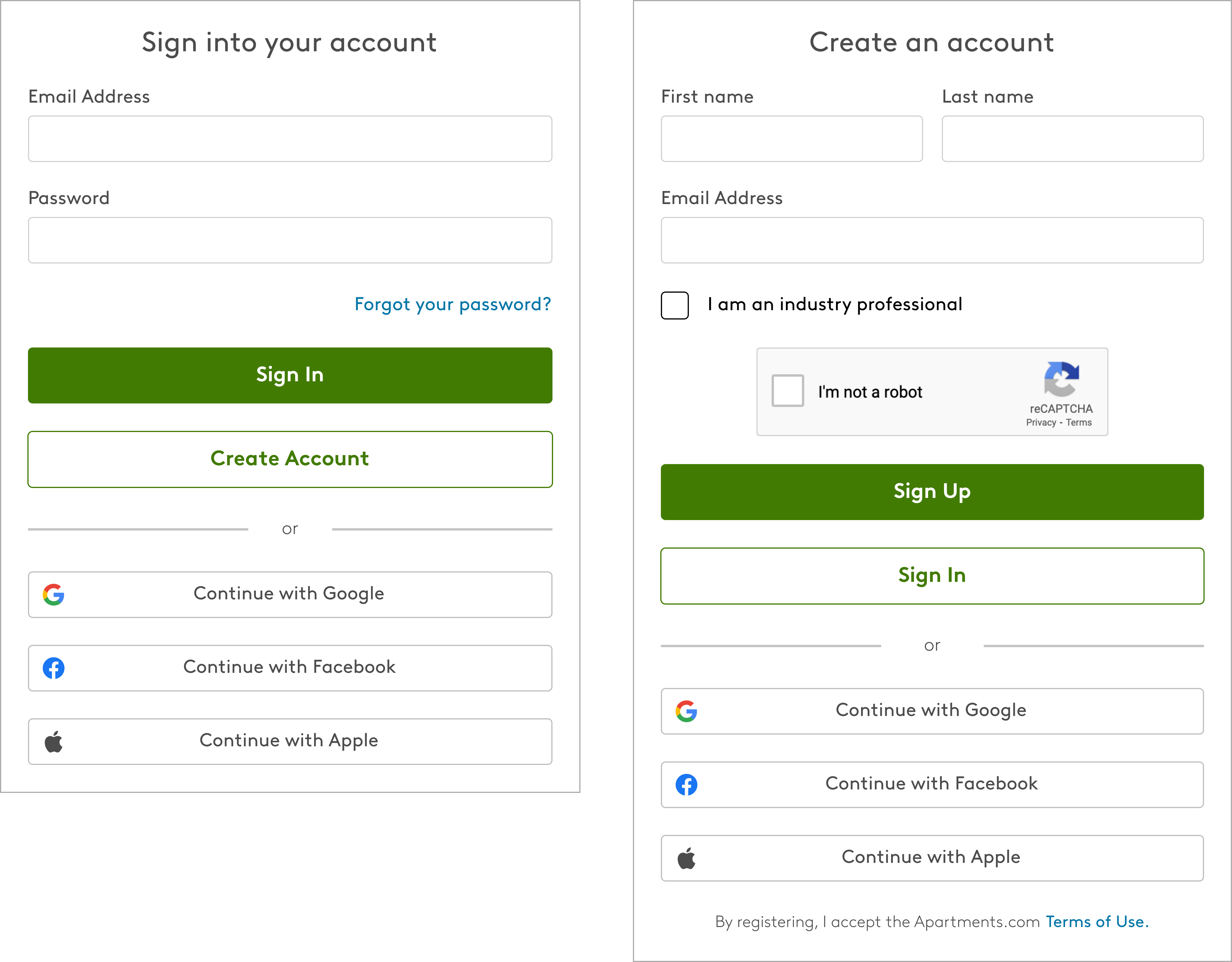
The reason for this modal design was to streamline the login and account creation process, while also keeping a similar look and feel that you might see on other sites. It was important that the user had both options available to them on each screen.
Search by Resident Dropdown
Background:This project pertains to the resident management section of the site from the rental managers point of view. Previously, the rental manager could only search by their properties to find their residents, and we wanted to give them the option to search for properties by resident names if they so choose. This aimed to improve the user experience for the rental manager by giving them more methods of finding particular residents and/or properties. I designed for both desktop and mobile.
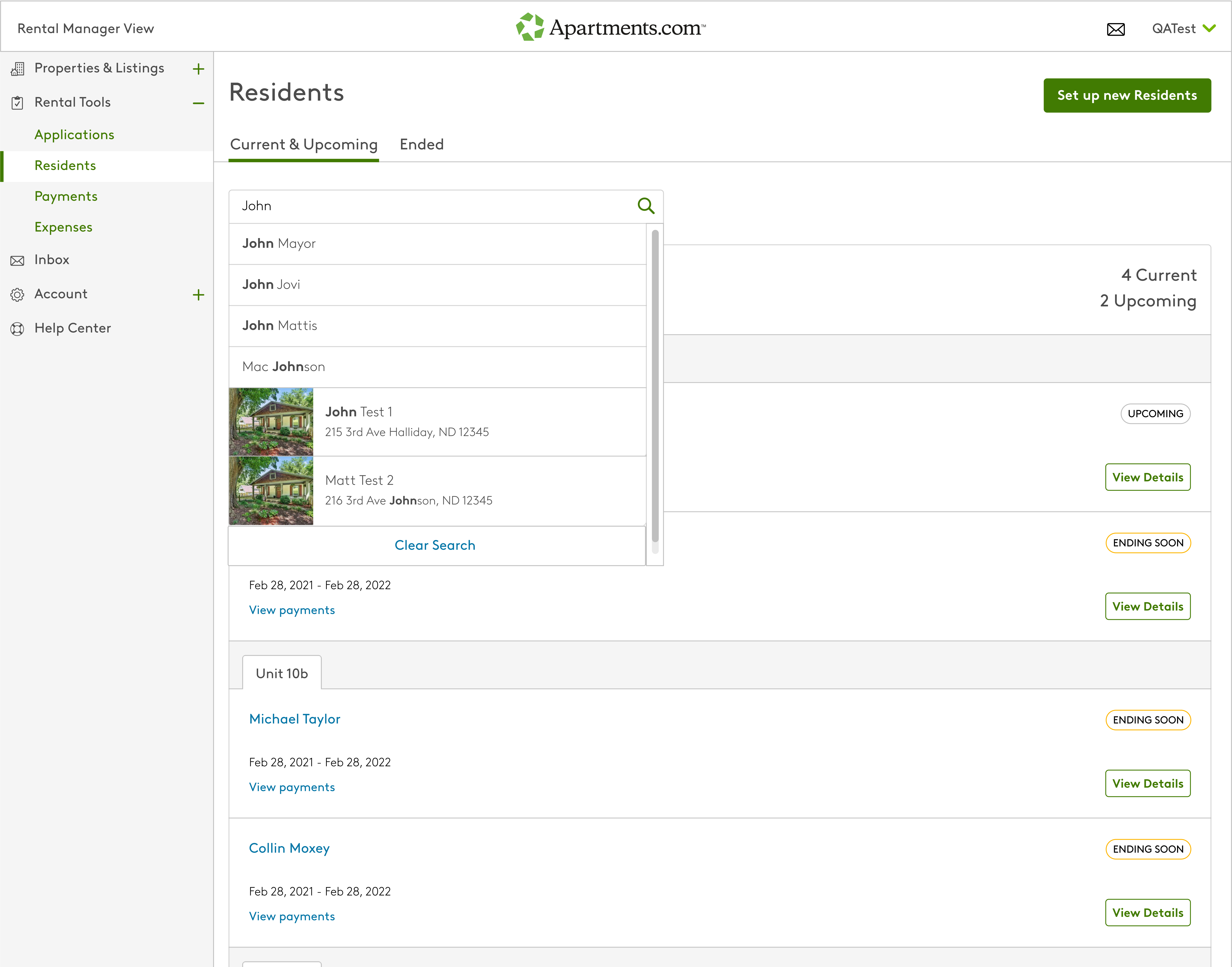
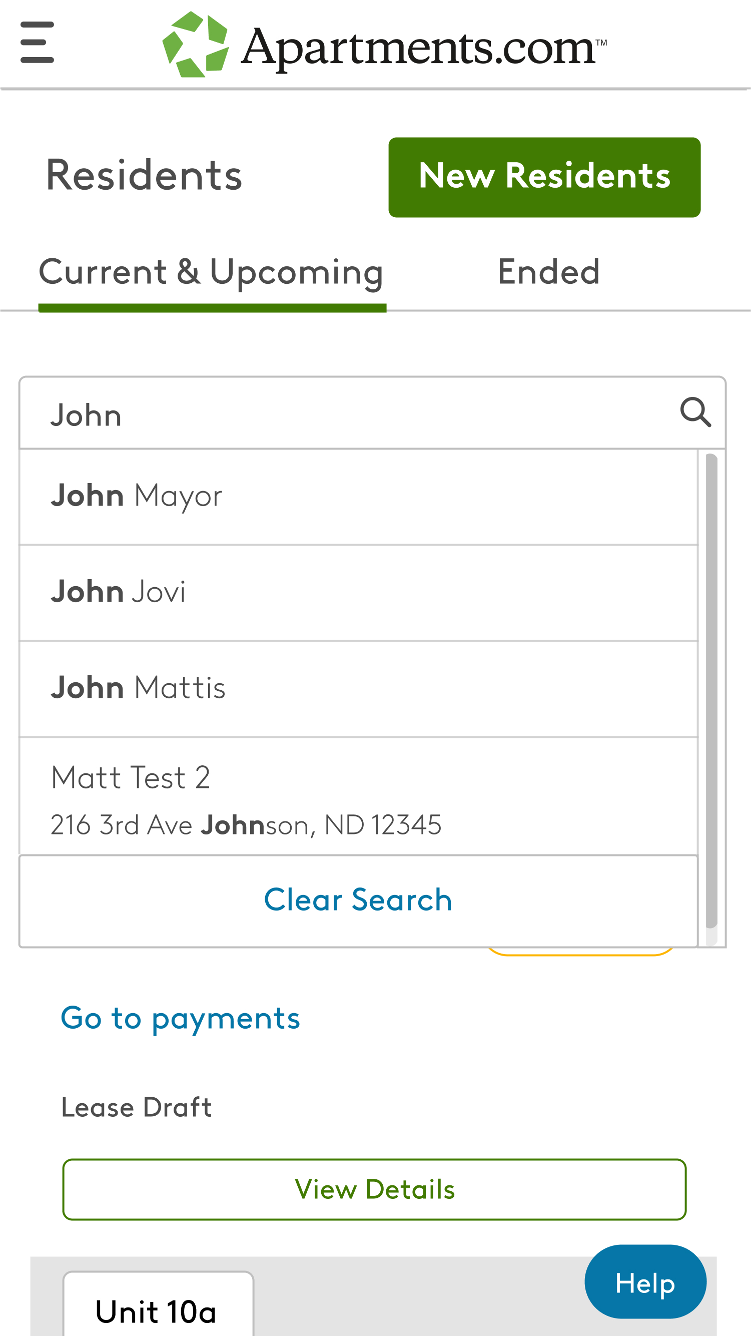
I was able to represent these intended changes by presenting a drop-down when the user searches for a term. In the screenshot you can see that the user has types in the term “john”, and the results have been populated with both residents and property names that include the search term. I also represented the logic that would bold the terms that match the search in the dropdown, hence why john is highlighted as matching a first name, a last name, and even a property type.
Lastly, I represented a specific function in the dropdown where the search will always prioritize residents names when typed in the search. Properties will always appear after resident names in the dropdown, and the list will basically be split between both residents and properties whenever the search term matches both a resident and a property. Click here to see a closer and more high quality representation.
App Download Banner
Background: This project is fairly simple, but the goal was to create a banner at the bottom of the screen that appears when the user is accessing the site from their mobile device. The banner is there to encourage the user to download the Apartments.com mobile app.
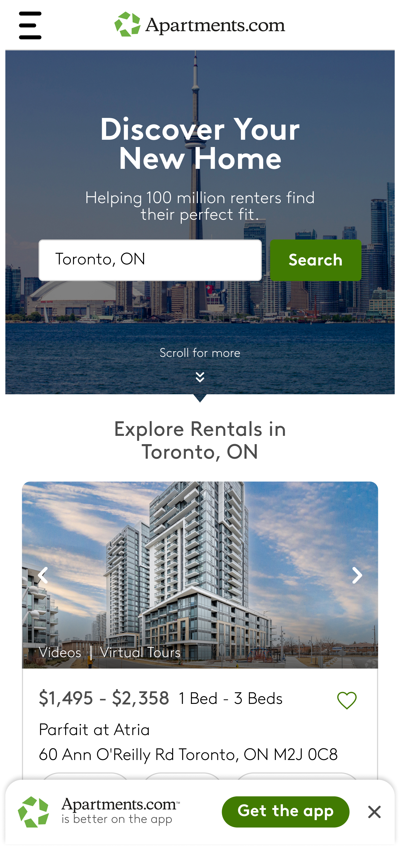
With this download banner, the user would be able to press the “Get the app” button that would take them to their device's associated app store. From there they could download the Apartments.com app and enjoy an easier mobile browsing experience. The idea was that this banner would lead to more app downloads and increase the apps ranking in the store.
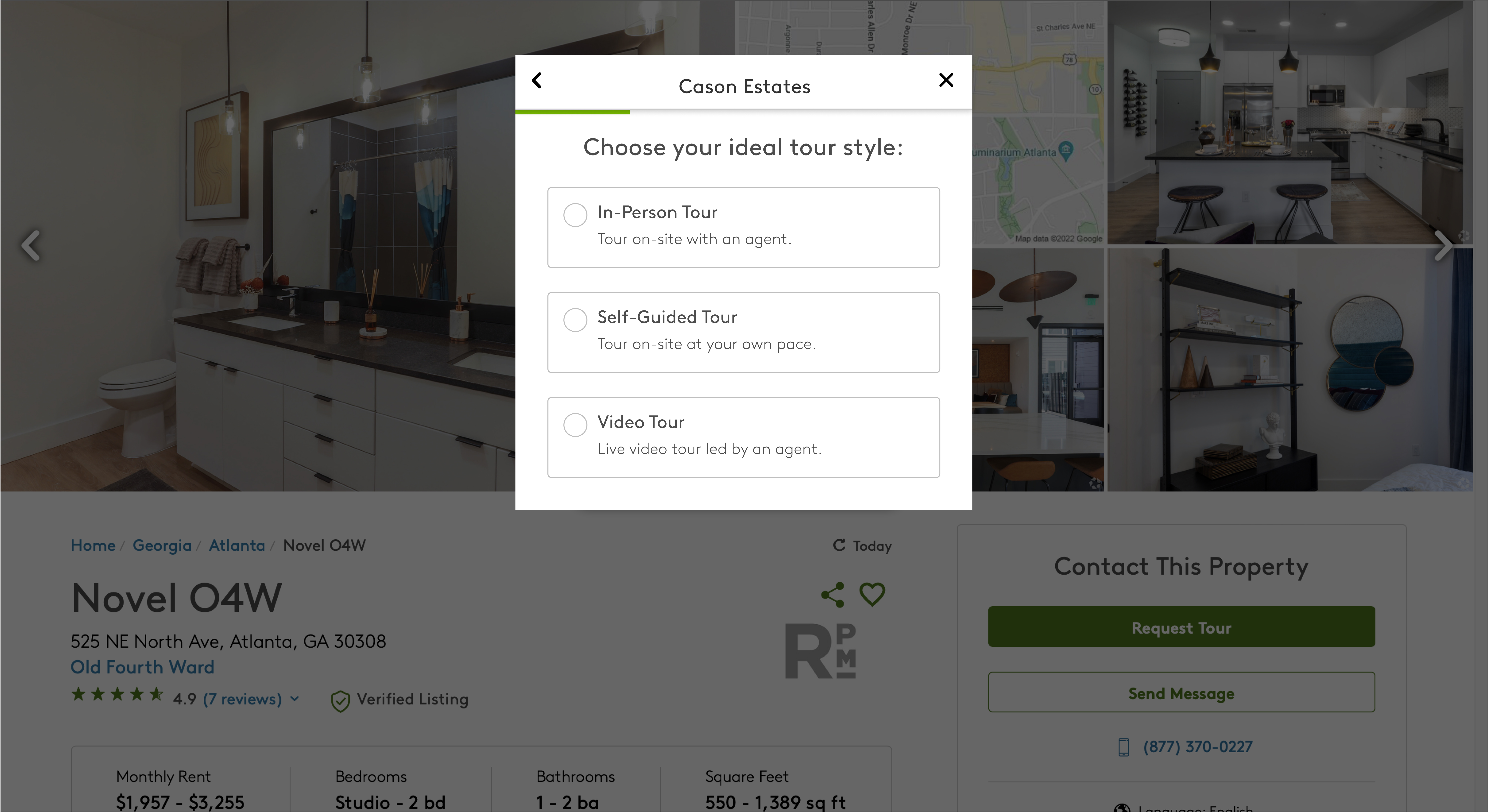
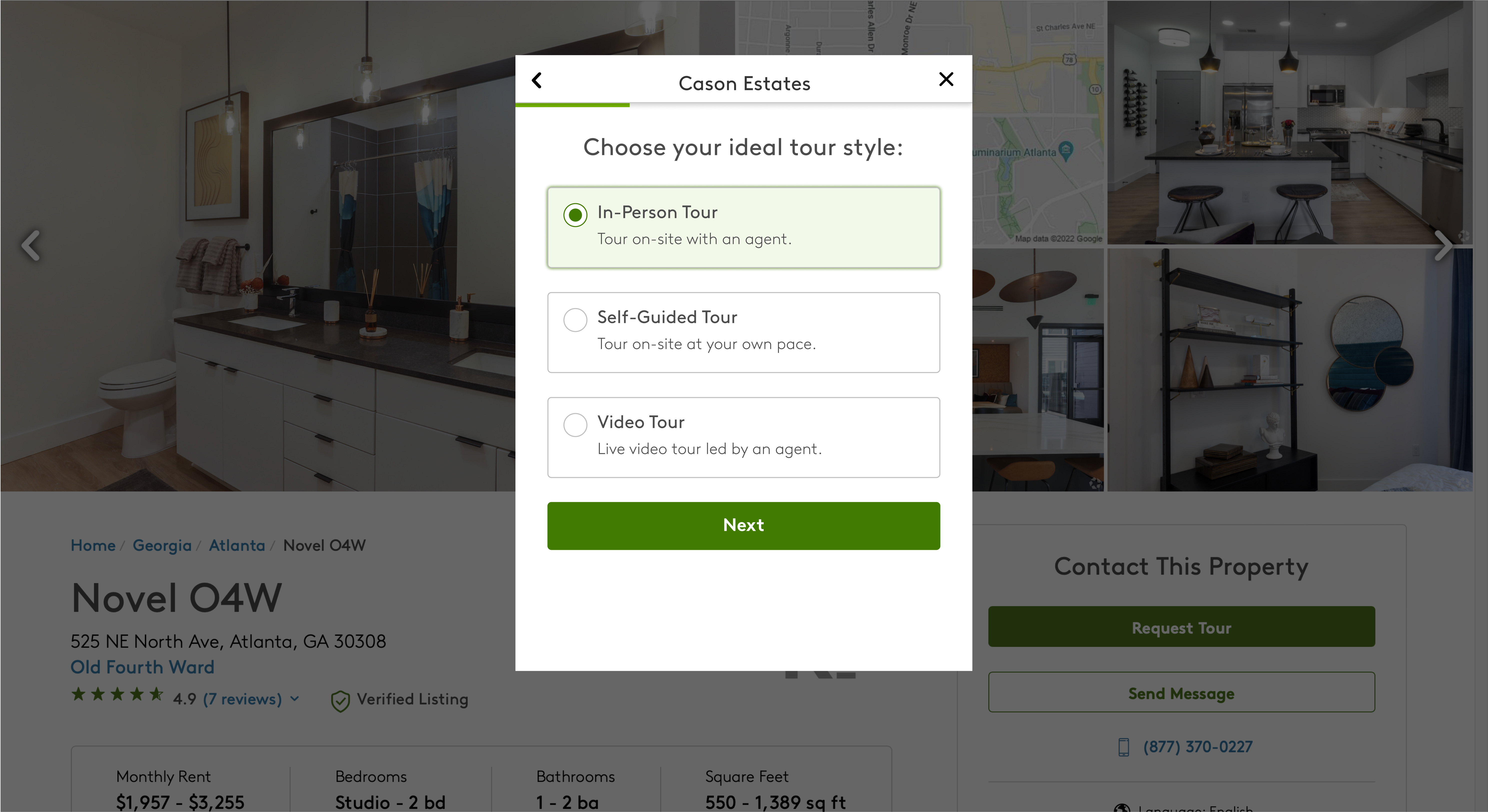
Tour Scheduling Modal
Background:On Apartments.com, when viewing a property, the user may have the option to request a tour of the property. We set out to create a modal that would allow the user to choose their specific tour type, rather than just sending off a generic email to the property owner expressing their interest. Here is an example of the mobile modals in both a selected and unselected state.
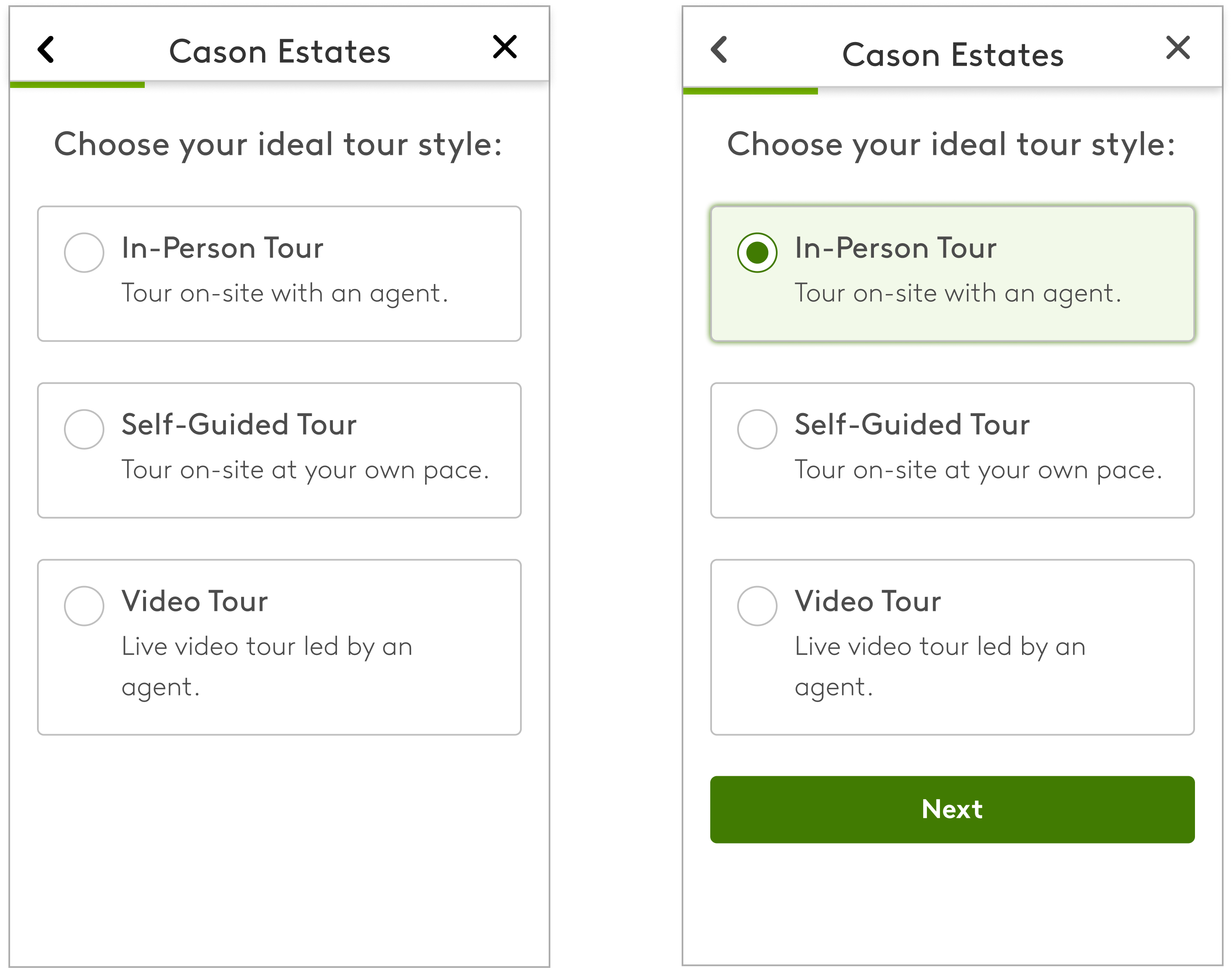
It was important that we surfaced not only the tour types, but also short descriptions about each tour to better give the user more insight. We took the modals through multiple rounds of user testing to determine the proper terminology for each tour type. We ended up with our most popular and intuitive types: In-Person, Self-Guided, and Video Tour. Below you can also see some examples of the modals that would appear on the desktop.
Rent Affordability Calculator
Background: On Apartments.com, we have a tool that allows the user to calculate how much rent they can afford. We use factors such as their yearly income and the percentage of that income they are willing to spend on rent. Once that information is entered we dynamically show their new budget. After that, the user can then choose a location and search for apartments that specifically fit within their budget. Below I created both desktop and mobile versions of the tool.
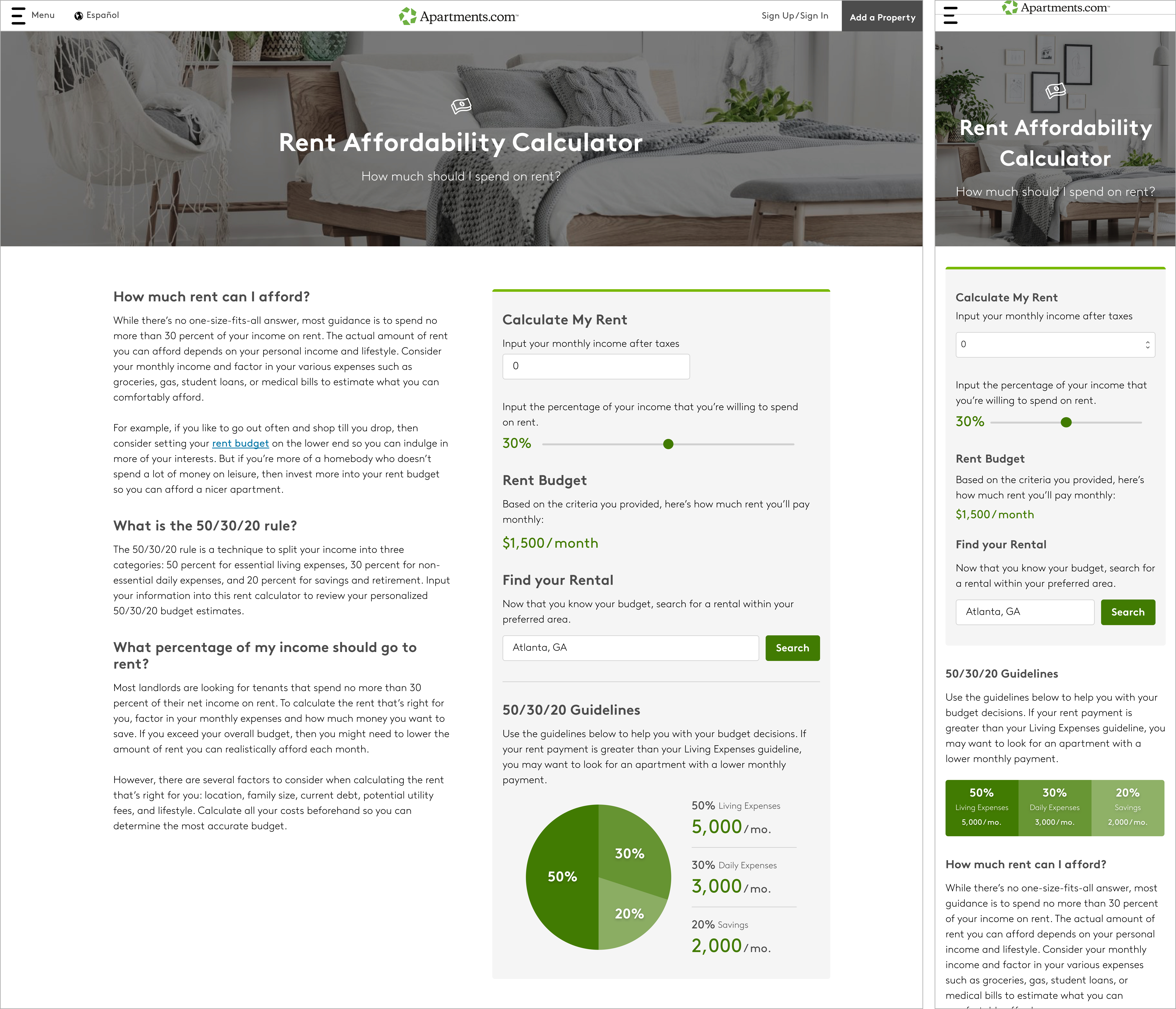
It was important that we made the tool easy to use and that the feature provided benefits to the user. The design and hierarchy of color and typography were intended to be intuitive. I worked closely with a UX writer to ensure that the content of the page was usable and easy to understand. It is also worth noting that these features needed to appear the same across devices, so the mobile design was built first to ensure proper functionality.