Figma Vector Tutorial Prototype
Final Project Write-up
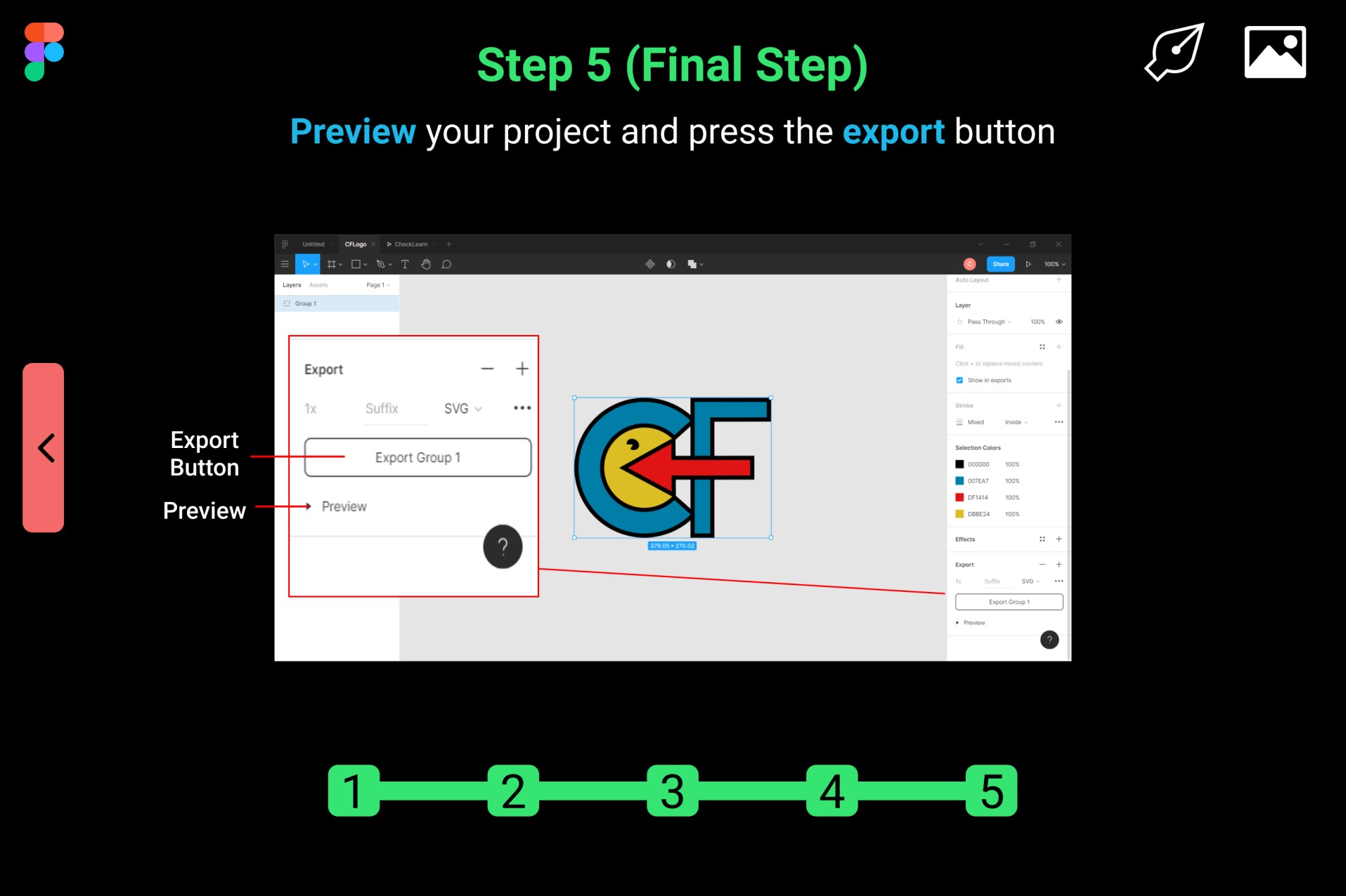
The prototype I created is a step-by-step tutorial on how to create a vector image in the Figma prototyping tool. I utilize the following principles of design to ensure that my prototype is visually effective and that my tutorial is easy for the user to follow.
Tesler’s Law states that every application has an inherent amount of complexity that cannot be removed or hidden. This issue is dealt with, either in product development or in user interaction. It is important that this level of complexity remains unknown to the user, therefore, I used the following principles to ensure that the prototype is simple and understandable.
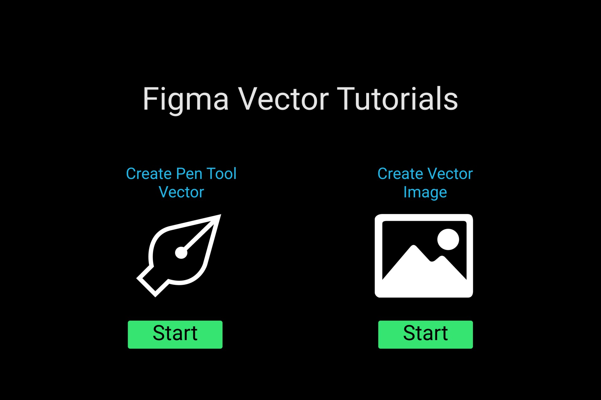
Miller’s Law states that the average person can only keep 7 (plus or minus 2) items in their working memory. A users’ working memory consists of immediate information that is necessary when dealing with conscious decision-making. My prototype contains 6 total pages including the introductory page. My tutorials consist of 5 and 7 total steps that end up within the 5-9 range. These number of steps ensure that my tutorial is concise, so that the steps, as well as their descriptions, are easily processed into the user’s long-term memory.
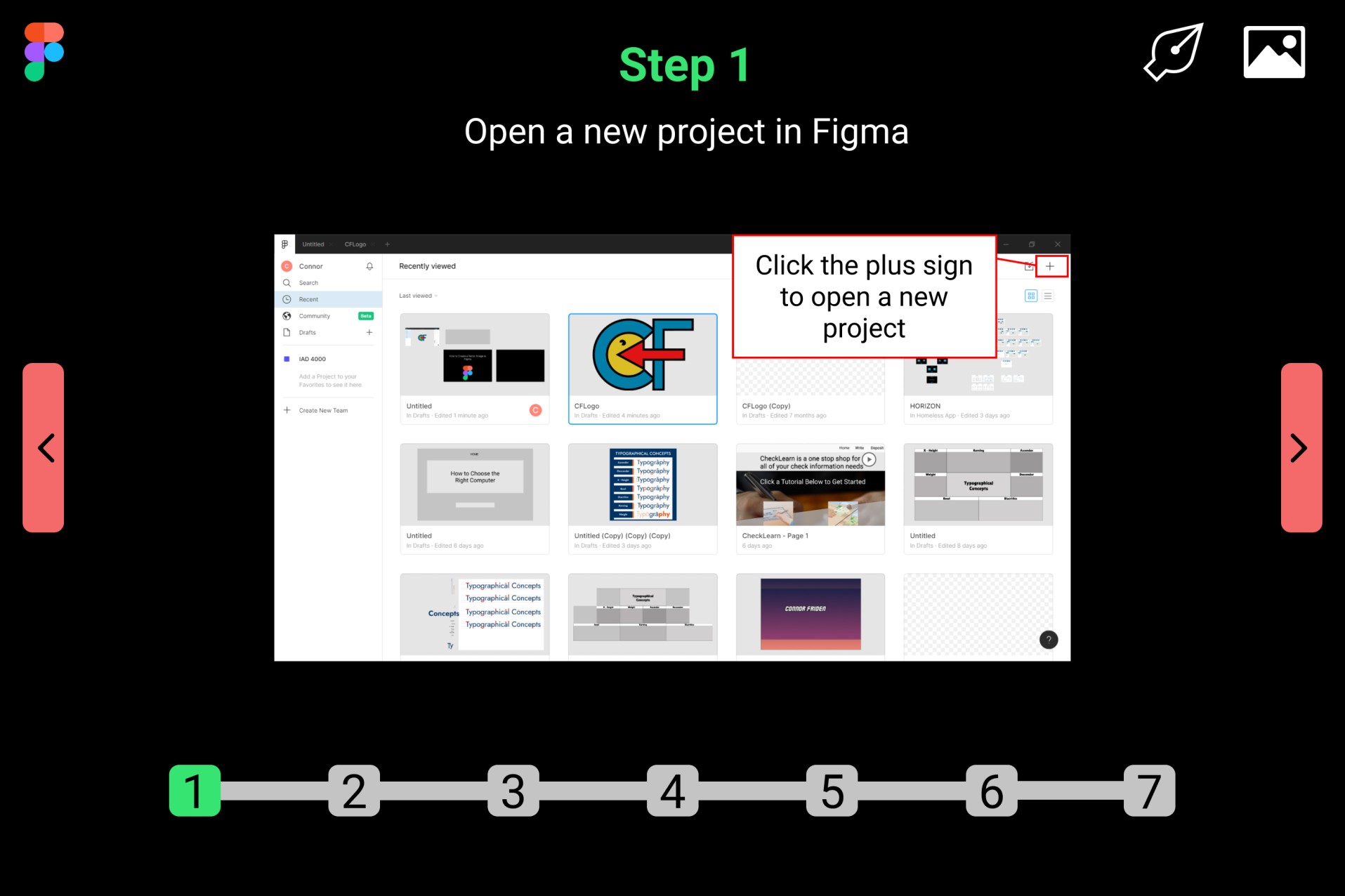
Chunking is when information is grouped and presented in smaller units. The chunking of information allows for it to be easily remembered by the user. Each step and its instructions are chunked into their own respective page. The steps become easier to remember when they each share their own page, and it aids the user in dealing with intrinsic cognitive load.
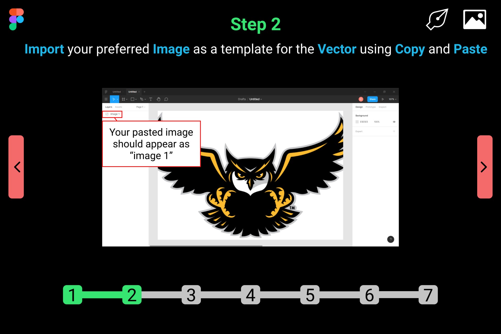
The Law of Proximity states that objects that are close to one another are seen as being grouped together. The use of proximity allows the user to easily organize and differentiate the information they are shown. My tutorials’ steps and descriptions are in relative proximity to their respective images. The user can perceive a step, description, and step image as one group.
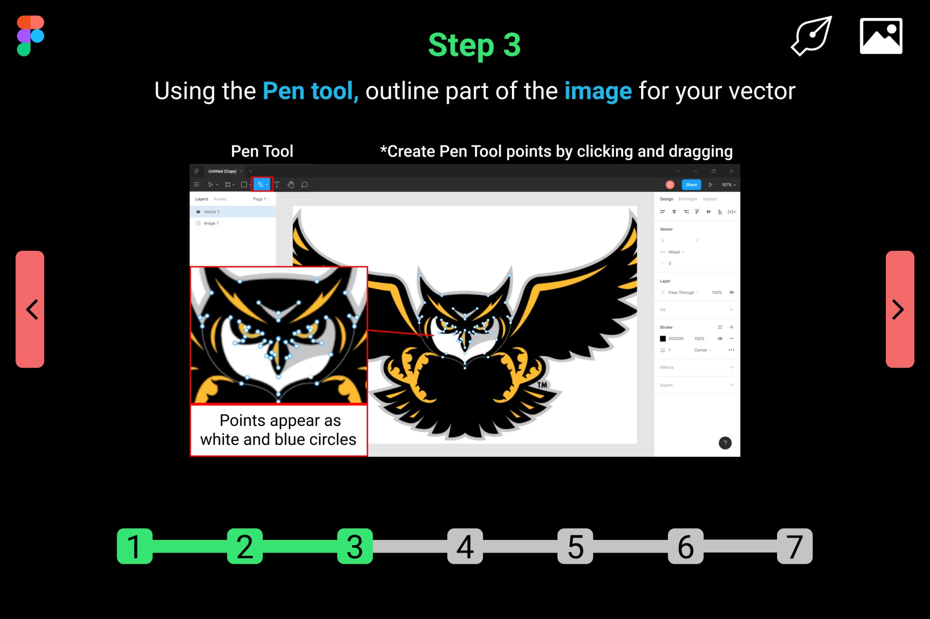
The Von Restorff Effect predicts that when similar items include an item that differs from the rest, that item is more likely to be remembered. On each step page, the key terms in each description are bolded and blue while maintaining the same font size as the rest of the text. The key terms remain similar to the rest of the content, but they stand out in a way that makes them more memorable than the rest of the content.
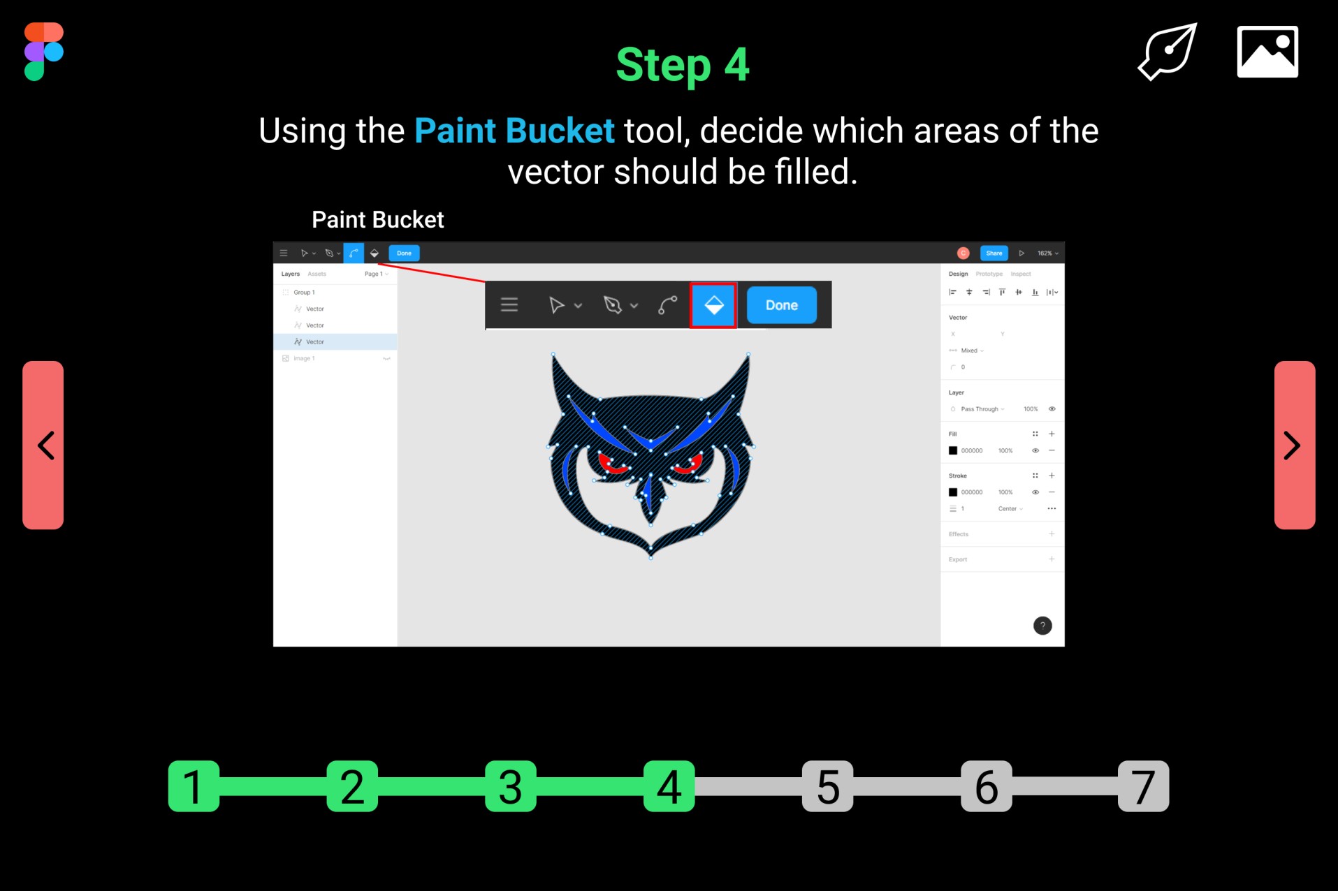
The Zeigarnik Effect states that incomplete or interrupted tasks are more likely to be remembered than tasks that are complete. This effect is represented in the form of a progress bar that appears at the bottom of each step page below the step image. The progress bars feature numbers 1-5 and 1-7, that turns green when on their respective page. Each step has an associated number. The progress bar also fills up as the user progresses through the tutorial; therefore, unless the tutorial is finished, it gives off the appearance of an incomplete task.
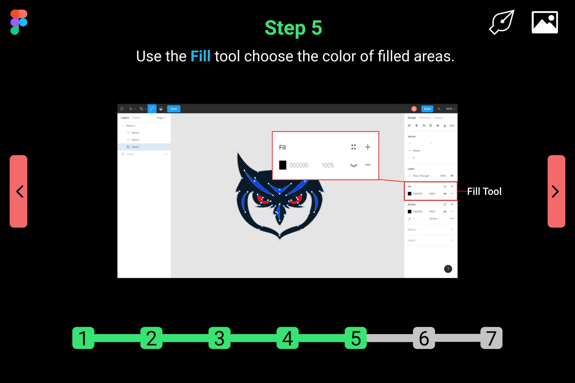
The Serial Position Effect states that users tend to remember the first and last part of a given sequence. The first and last steps are short and simple, but also the most important of the tutorial. The first step involves opening a project to begin the tutorial, and the last step involves reviewing and submitting the project. These are the two most important steps of the project, which is why they are found at the beginning and end.
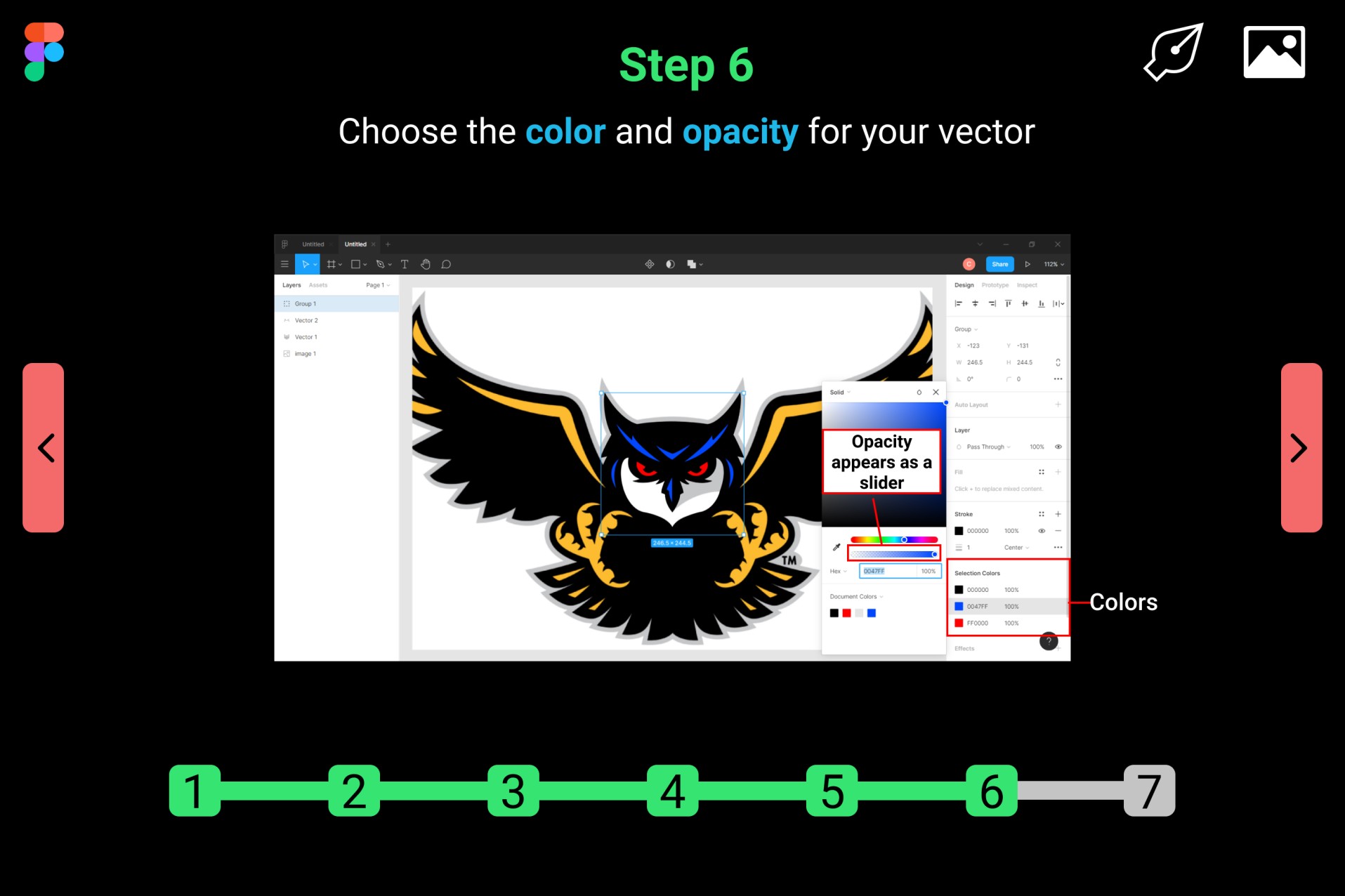
Fitts's Law states that the time it takes to reach an object is the result of the distance to and size of the target. The homepage of the prototype has large starting buttons in the center of the page. The forward and back buttons are also conveniently centered on the page
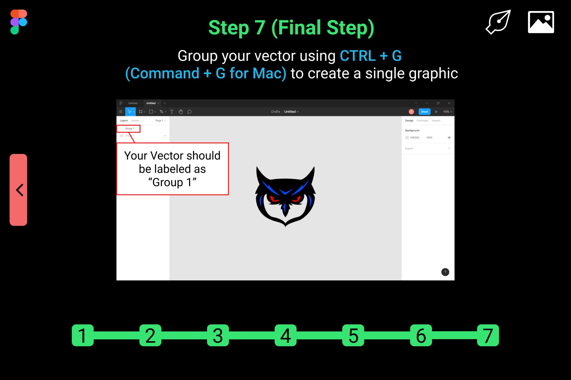
Hick's Law states that a user's decision-making time increases with the number and complexity of their choices. Steps in the tutorial are simply listed by number on the progress bar at the bottom of each page. This reduces the time it takes for the user to decide which step they wish to navigate to. Otherwise, they would need to go through every single page to find the desired step.

Jakob's Law states that users spend most of their time on other sites, so they prefer sites that function in a similar way as other sites. Each step page features a homepage icon on the top left. The back button is featured on the left and the forward button is featured on the right, which is common in most websites.
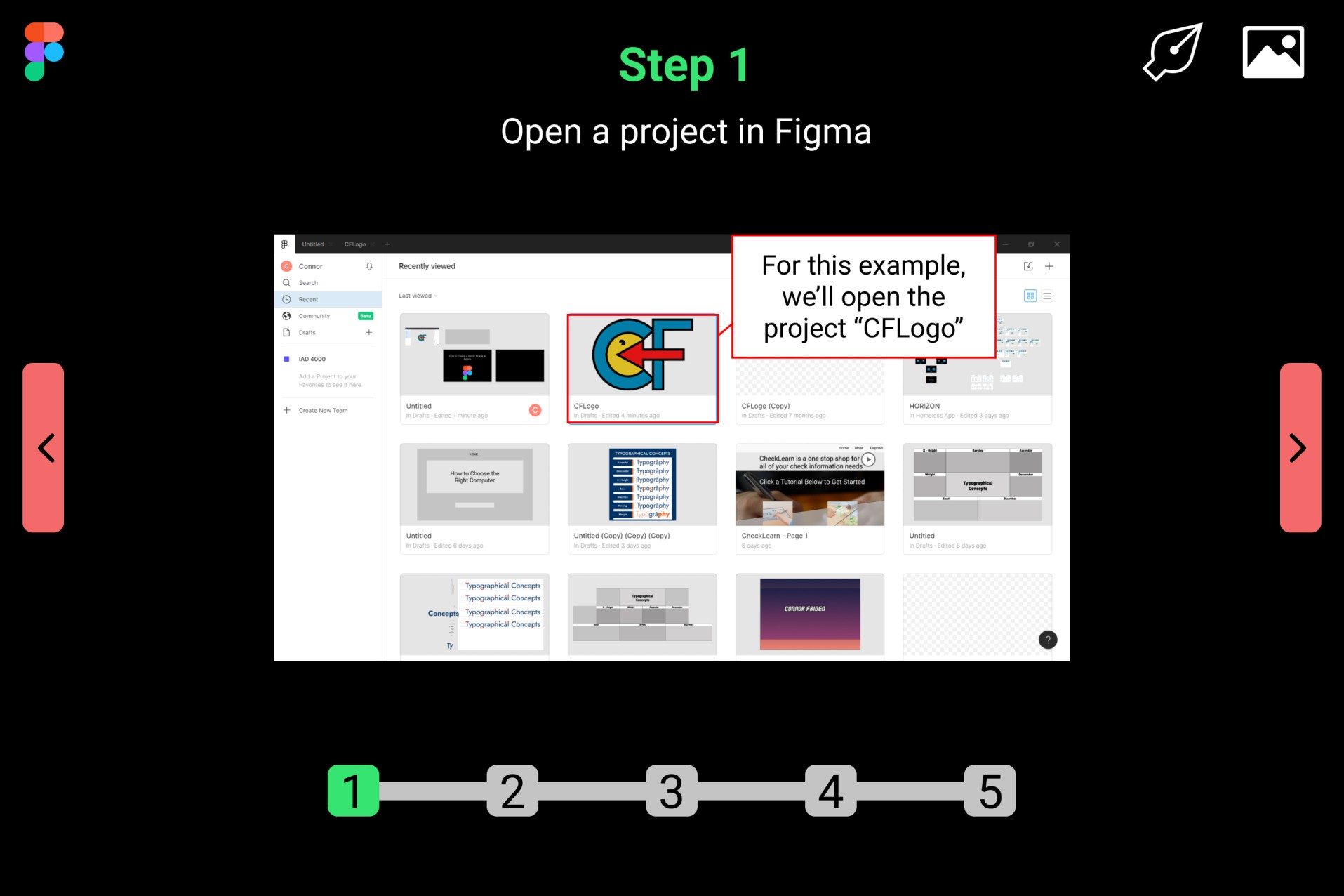
The Coherence Principle states that users learn better when extraneous material is excluded. In the tutorial, each step description is concise and only includes important information pertaining to each step.
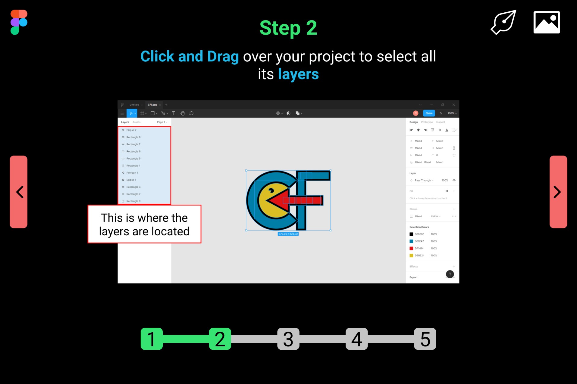
The Signaling Principle states that users learn better when there are visual cues that highlight essential material. The titles of each step are bolded and green. Keywords in each step description are bolded and blue. The words are bolded and color-coded to let the user know that it is the most important information on the page. These features reduce the users’ extraneous cognitive load by directing them to the most relevant and important information.
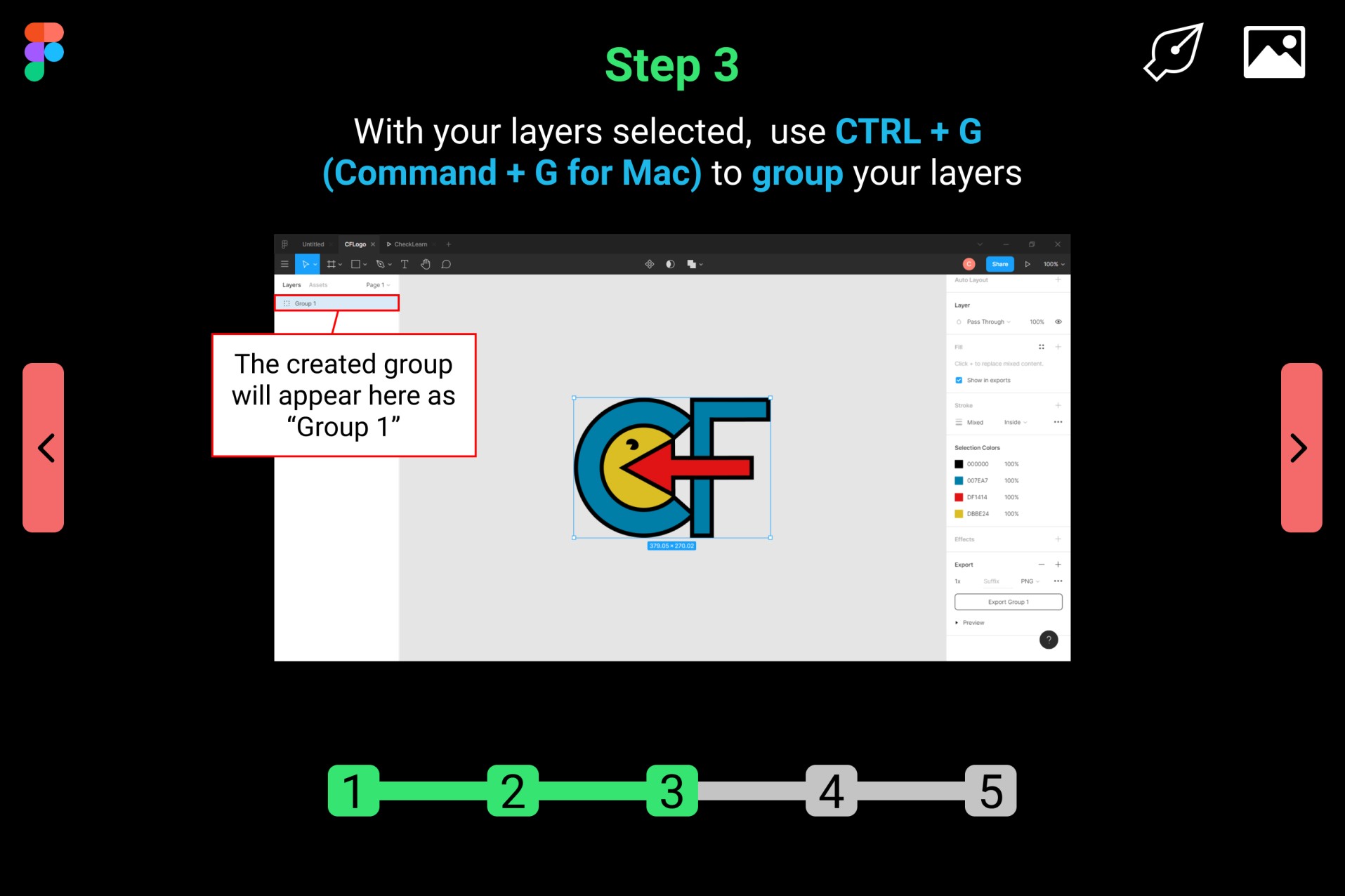
The Multimedia Principle states that users learn better from a combination of words and pictures, rather than just words. Each step page features a step description and an associated step image to act as a visual aid. The images associated with the steps work to enhance germane cognitive load and increase the users’ understanding of the subject matter.
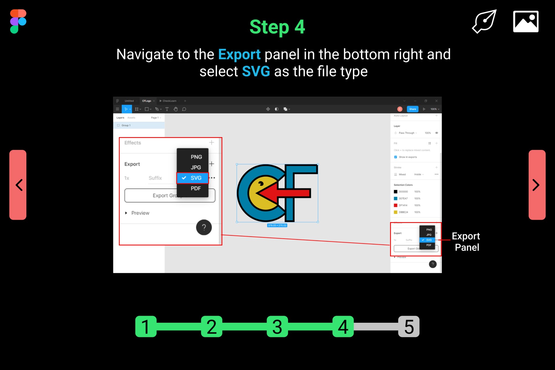
The Spatial Contiguity Principle states that users learn better when corresponding words and images are presented near one another. Steps include red boxes with corresponding text. The boxes and their text highlight the locations of the steps and their images. The associated text descriptions also serve as hints to guide the user through the step.
