- Tools: Figma, Adobe Indesign
- Roles: Designer, Researcher, Writer
- Team: Connor Friden (Myself)
- Timeframe: Feb. - April 2021 (3 Months)
In my Visual Design II course, the goal of our project was to create two distinct brand identities using specific principles of visual design. I made two lockups (the final form of a logo and all of its combined elements). These elements include the logotype, icon, and tagline. Once the lockups were created for both brands, I designed two style guides, which explain design decisions and adequately define the brands’ intention.
For this project, students chose two keywords that would describe the identity of each brand. Our design decisions in our lockups would then reflect those keywords. Once we received feedback and approval of our lockups, we created two separate style guides to justify our design decisions for each brand. My brand lockups underwent many changes throughout the process based on feedback from the professor and my classmates. When designing the identity of each of my brands, I had to consider my color scheme, typeface, and choice of line and shape.
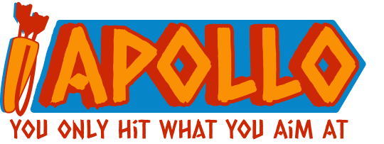
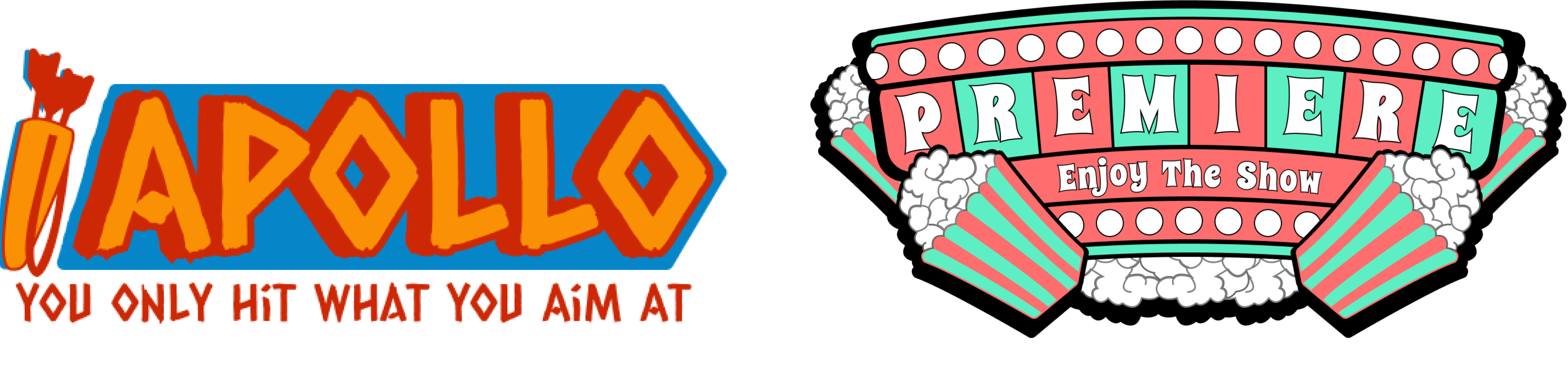
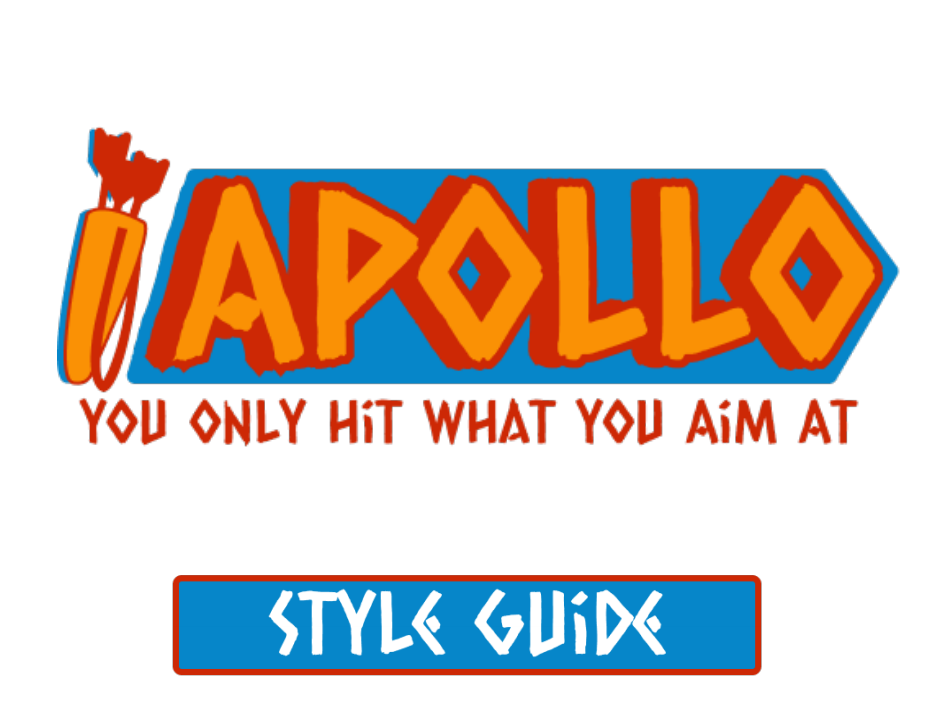
This lockup represents an archery brand called Apollo. The words chosen to describe this brand identity are bold and dynamic. Boldness represents a willingness to take risks, while dynamic represents constant progress and improvements. I wanted a brand that represented the embodiment of archery itself through my choice of keywords and lockup design.
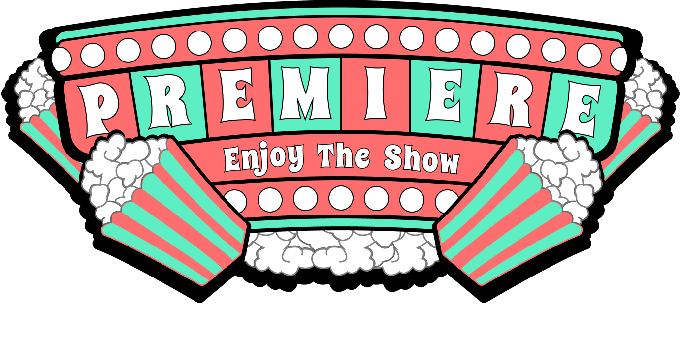
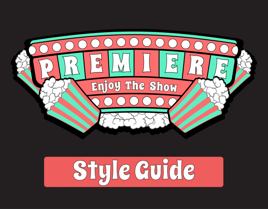
This lockup represents a movie theater brand called Premiere. For this brand, I wanted to convey an appearance that was entertaining and friendly. At the movies, people expect an entertaining experience in an environment that is friendly and welcoming. I wanted a brand that personified the ideal movie-going experience, so I implemented specific design elements to reflect this intention.

For Apollo, I chose the colors red, orange, and blue as part of a split-complementary color scheme. A split-complementary color scheme is defined as a primary color used with two analogous colors to its complement. Split-complementary colors give off a striking and dynamic appearance.
I chose Low-key (dark in value) variants of these because they appear bolder and more serious. Low-key colors also offer a more professional and competitive appearance that goes great with a sport’s brand such as Apollo.
I also chose two warm colors and one cool color; the warm colors being red and orange, and the cool color is blue. Red and orange are successful in capturing one’s attention, and blue balances out the warm colors to avoid overbearing. Blue also acts as the background for the logo and icon, creating the perfect amount of contrast in the lockup.

For Premiere, I chose the colors red and green as part of a complementary color scheme. A complementary color scheme is a pair of colors that are opposite one another on the color wheel. Complementary colors create the most substantial contrast, which is perfect for an eye-catching movie theater brand.
I chose high-key (lighter in value) variants of these colors to give the lockup a more friendly and entertaining appearance. High-key colors are much more inviting and make guests feel welcome.
I also chose one warm and cool color, red and green. I chose these colors because they balance each other out very well. Red is the more dominant color of the lockup to represent the entertaining side of the brand, and green is a reminder of the brands’ friendly intention. Also, White and black are used as accent colors that emphasize the scheme’s primary colors without causing interference.
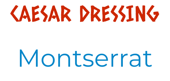
For Apollo’s typeface, I chose Caesar Dressing, which is a decorative typeface. Caesar Dressing is the lockups primary typeface. This typeface gives off a bold and dynamic feel due to the thickness of its letters and the abundance of diagonal lines. Montserrat, a sans-serif typeface, is used for body text because it is clean and professional. Caesar Dressing is used only in the lockup and headings.
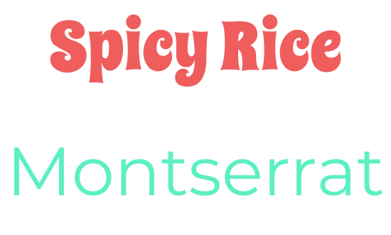
For Premiere’s typeface, I chose Spicy Rice to achieve an entertaining and friendly appearance. The curvy and decorative nature of the typeface ensures that the lockup is entertaining without sacrificing its intention to portray a friendly environment. Montserrat, a sans-serif typeface, is used for the body text because it is both clean and professional. Spicy Rice is used only in the lockup and headings.
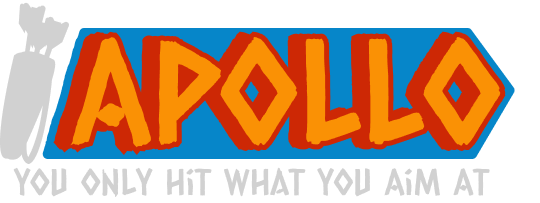
In the lockup for Apollo, the word dynamic is represented by the shape and appearance of our logo and lockup overall. Diagonal lines are used extensively throughout the lockup in order to appear dynamic. Everything from the use of typeface, the diagonal blue background, and the icon all represent a dynamic feeling.
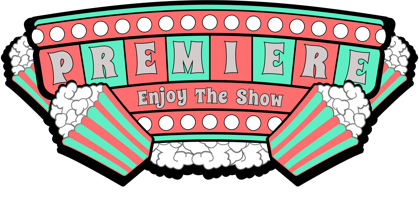
The lockup for Premiere is abundant with many curved lines and rounded shapes. Curved lines are used in an attempt to create a more friendly and inviting design. As you can see, not only is the typeface curved but each individual shape has curvature as well. Everything from the popcorn to the lights is rounded to achieve the intended impression of friendliness.
Designing two brand identities was an enjoyable experience, but it was not without its difficulties. Early on, there were many challenges when it came to ensuring my brand was in line with design principles. Thanks to feedback from my professor and classmates, I was constantly improving and getting better at the design process. I am proud of the brand identities I have created, and I have become much more confident in my skills as a visual designer.